
The work spans repositioning brands in need of a fresh direction, launching new products and categories, building trust in sectors where credibility is everything, and making everyday choices clearer, whether that's on shelf, on screen, or in a moment of uncertainty.
Brand strategy, identity, communication and packaging all sit within this, not as separate disciplines, but as different expressions of the same thinking.
An anti-blemish skincare range needed nature and science to feel like one idea, not two competing claims. Strategy and identity were built around that balance, carried through naming, packaging and tone of voice, so every product reads as credible and approachable.
Brand Identity & Packaging Design
A national union representing school leaders needed a brand that matched the strength of its voice. Identity was built around growth, leadership and community, values at the heart of the organisation, so every document, from advice to campaigns, would be recognised at a glance and trusted on sight.
Brand Strategy, Brand Identity & Visual Language
Built on the belief that dogs deserve the best too, My Dog Spa needed a premium identity to match. Naming and identity gave each fragrance its own personality, reflecting the different personalities of the dogs they're made for. Design brought luxury and craft to the range, elevating something as everyday as dog shampoo into a moment of indulgence.
Brand Positioning, Naming, Identity & Packaging Design
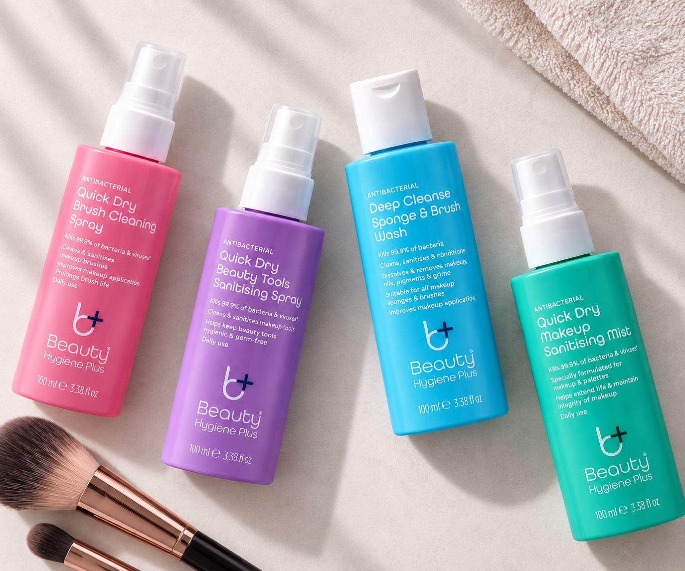
Beauty Hygiene Plus
Makeup brushes and sponges are used daily but rarely cleaned. Beauty Hygiene Plus closes that gap with a range of sanitising products for beauty tools, proven anti-bacterial, simple to use, positioned and designed to feel as trustworthy as the claim itself.
Brand Positioning, Naming, Identity & Packaging Design
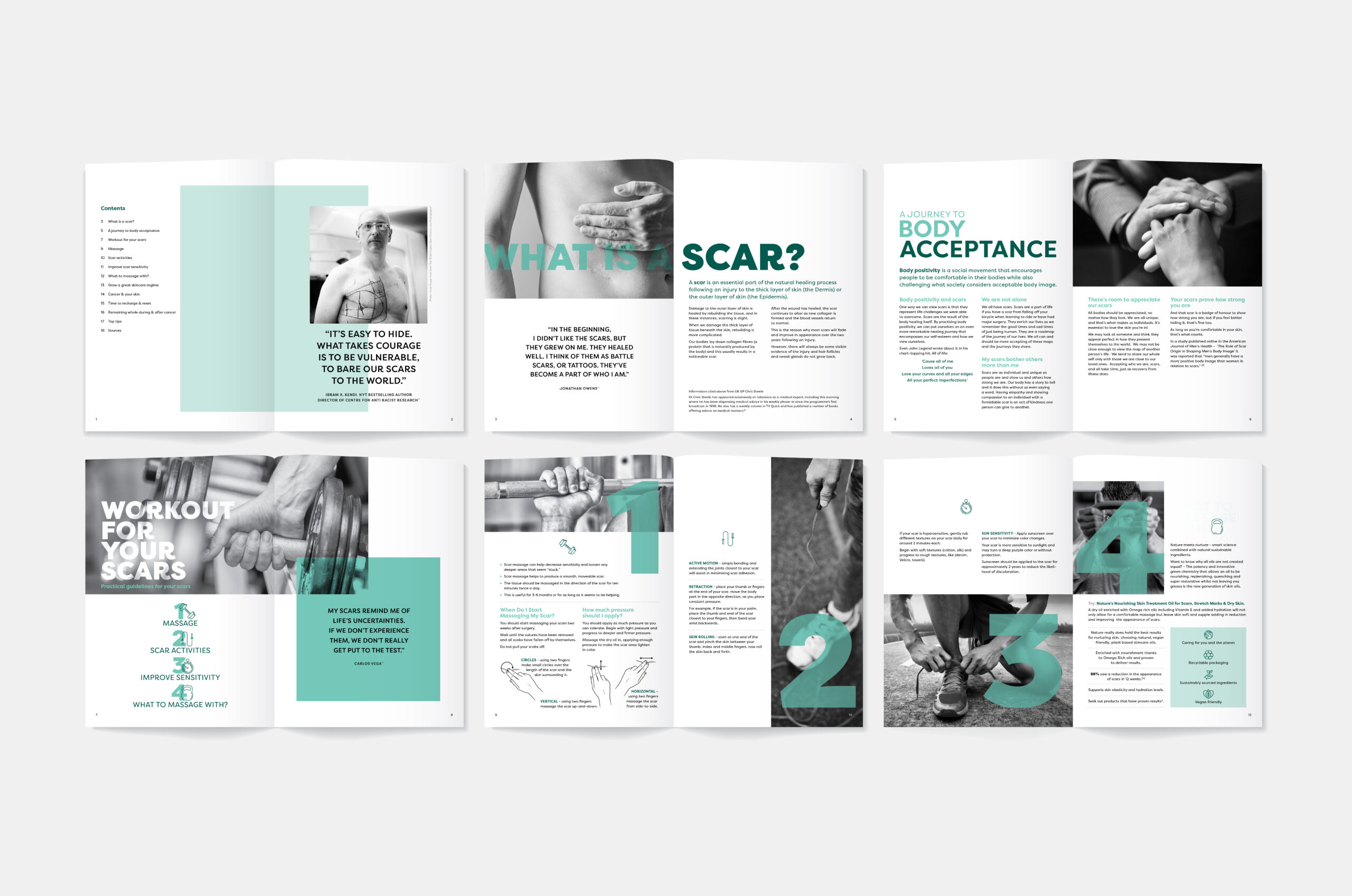
Nurture x Look Good, Feel Better
Surgical scars can be hard to process, especially for men, for whom self-care can feel alien. A guide was created, using real quotes and imagery to reflect lived experience. The design carried the emotional honesty of the subject, while the "scar workout" concept tied the guide to the charity's skin fitness workshops.
Print Design
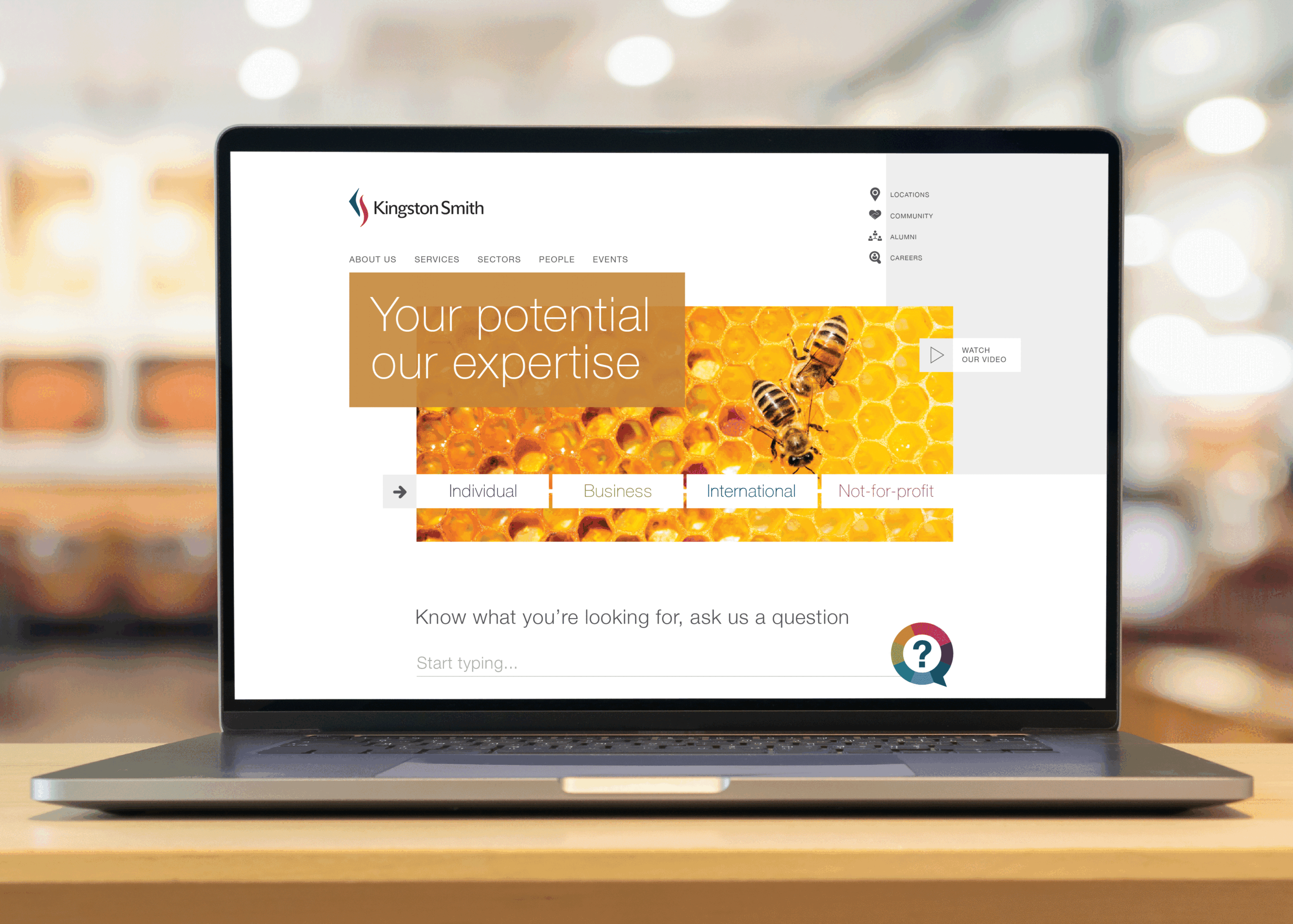
Kingston Smith
An accountancy firm needed a site that felt personal, not generic. Design was structured around the individual journeys of key client types, so each visitor found guidance relevant to their own needs and experiences.
Visual Language & Website Design, Development by Hype London
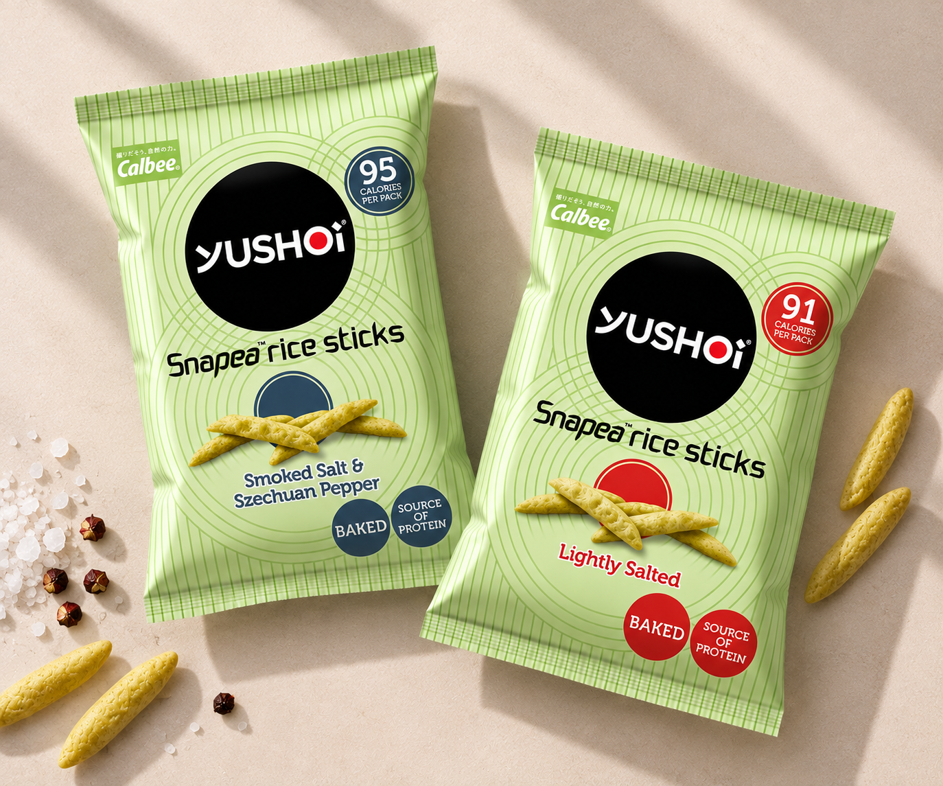
Yushoi
A range of Japanese-inspired, better-for-you snacks, new to the UK market, needed a name and identity that reflected where the inspiration came from. "Yushoi" combines Yushu (excellent) and Shoi (act or deed), carried through into packaging that balances that heritage with taste appeal.
Naming, Brand Identity & Packaging Design


© Before Creative | Development: Hype London | HealthLab is a trading name of Before Creative Limited
Privacy & Cookies | Terms of Use | Accessibility | Contact studio@beforecreative.com